Redesigning the Future of Digital Banking Experience
A comprehensive case study exploring how we transformed a legacy banking platform into a modern, user-centric digital experience that increased customer engagement by 350% and reduced support tickets by 60%.
ROLE
-
Lead Product Designer
-
UX Researcher
-
Design Systems Lead
TIMELINE
-
January 2025 – June 2025
-
6 Months
-
3 Sprint Cycles
TOOLS & TECHNOLOGIES
-
Figma, Sketch
-
Adobe Creative Suite
-
Principle, ProtoPie
-
Miro, FigJam
Project Overview
In early 2025, we partnered with a leading financial institution to completely reimagine their digital banking platform. The existing system, built over a decade ago, was struggling to meet the expectations of modern users who demanded seamless, intuitive, and secure banking experiences.
Our challenge was not just to create a visually appealing interface, but to fundamentally rethink how customers interact with their finances in the digital age. This meant conducting extensive research, challenging long-held assumptions about banking UX, and building a design system that could scale across web, mobile, and tablet platforms.
The project scope included redesigning the account dashboard, transaction flows, bill payment systems, loan applications, investment portfolios, and customer support interfaces. We worked closely with stakeholders across product, engineering, compliance, and customer service teams to ensure our designs were not only beautiful but also technically feasible and regulatory compliant.
This case study documents our journey from initial research through final implementation, highlighting key decisions, challenges overcome, and the measurable impact our redesign had on both user satisfaction and business metrics.

Key Objectives
-
 Increase user engagement and active sessions
 -
Reduce customer support inquiries
-
Improve task completion rates
-
Modernize brand perception
-
Establish scalable design system

Team Composition
-
 2 Product Designers
 -
1 UX Researcher
-
1 Visual Designer
-
3 Frontend Engineers
-
1 Product Manager
The Problem
The existing digital banking platform was built in 2014, a time when mobile-first design was still emerging and user expectations were vastly different. Over the years, features were added incrementally without a cohesive design strategy, resulting in a fragmented and confusing user experience.
Our initial audit revealed several critical issues that were impacting both user satisfaction and business performance. The interface was cluttered with outdated visual elements, navigation patterns were inconsistent across different sections, and key actions required too many steps to complete. Customer support data showed that 40% of all inquiries were related to users being unable to find features or complete basic tasks. Mobile usage had grown to represent 65% of all sessions, yet the mobile experience was clearly an afterthought, with tiny tap targets, horizontal scrolling, and poor performance on slower connections. Security features, while robust, were implemented in ways that created friction and anxiety rather than confidence. Multi factor authentication flows were confusing, password requirements were unclear, and users frequently locked themselves out of their accounts. Perhaps most concerning was the data showing that younger users (18-35) were abandoning the platform in favor of newer fintech competitors. Exit surveys revealed that these users found the interface “outdated,” “complicated,” and “not trustworthy” despite the institution’s strong reputation.
73%
Users reported difficulty completing basic tasks
2.8/5
Average app store rating across platforms
40%
Support tickets related to navigation issues
Key Pain Points Identified
Confusing Information Architecture: Users couldn’t find basic features like bill pay or account statements
without using searchInconsistent Visual Language: Different sections used different button styles, colors, and typography
Friction in Critical Flows: Transferring money required 7+ steps with confusing confirmation screens
Lack of Personalization: Every user saw the same generic dashboard regardless of their banking habits
Accessibility Gaps: Failed WCAG 2.1 AA standards with poor contrast ratios and missing ARIA labels
Before State: Legacy Interface
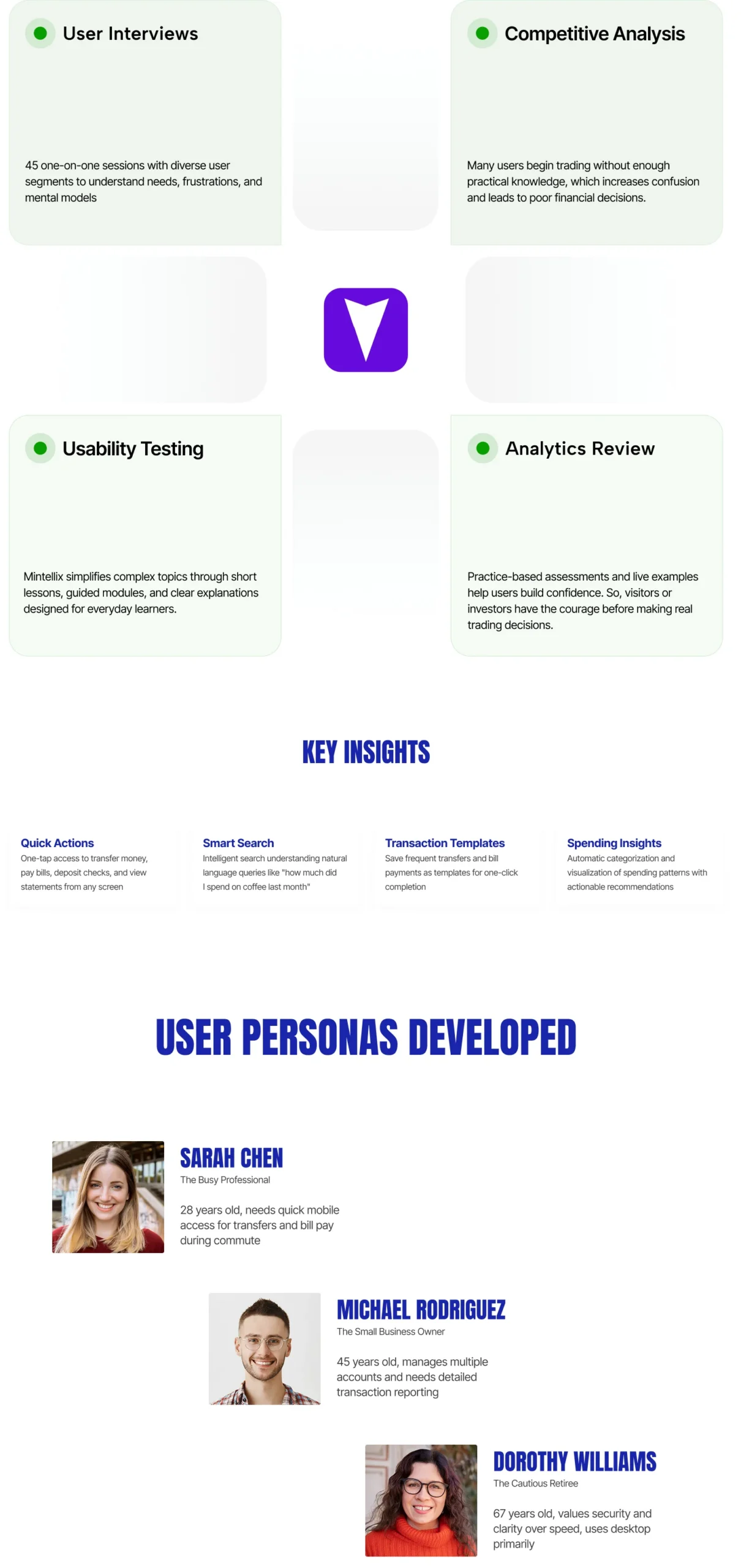
Research & Discovery
Before jumping into solutions, we conducted a comprehensive research phase that lasted six weeks. Our goal was to deeply understand not just what was broken, but why users behaved the way they did and what they truly needed from a digital banking experience.
We employed a mixed-methods approach combining quantitative analytics data with qualitative user interviews and usability testing. This allowed us to validate our hypotheses with hard numbers while also uncovering unexpected insights through direct user observation.
Our research team conducted 45 in-depth user interviews across different demographic segments, including young professionals, families, retirees, and small business owners. We also ran 30 moderated usability tests where participants attempted to complete real banking tasks while thinking aloud.
Analytics data from the past 18 months revealed fascinating patterns about user behavior. We discovered that 80% of users only used 20% of available features, suggesting that the interface was overwhelming rather than empowering. Heat maps showed users clicking on non-interactive elements, indicating poor affordance design.
Competitive analysis of leading fintech apps and traditional banking competitors helped us understand industry best practices and identify opportunities for differentiation. We created detailed feature matrices and conducted cognitive walkthroughs of competitor flows.
Research Methods
High-Fidelity Designs

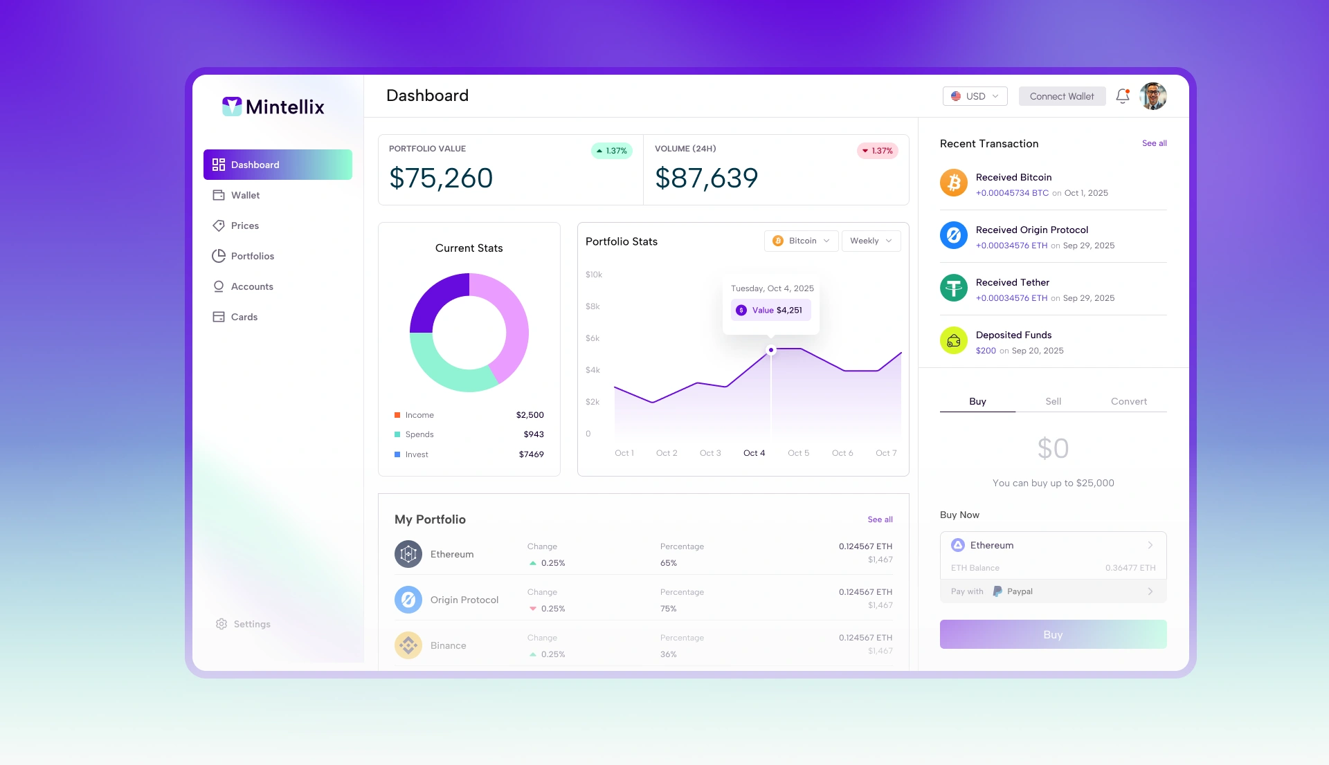
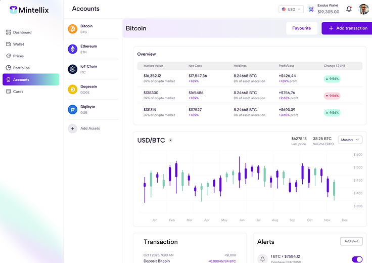
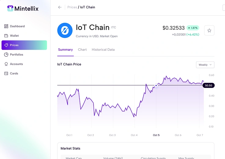
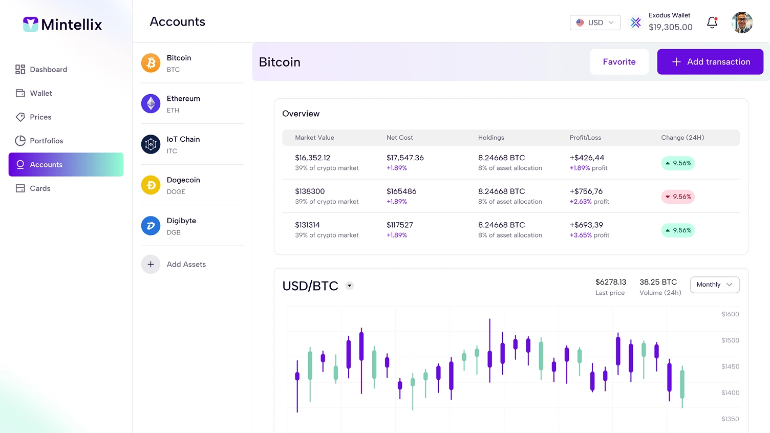
Dashboard Design
Personalized dashboard with quick actions, account overview, and spending insights
Results & Impact
Armed with research insights and stakeholder alignment, we embarked on a comprehensive redesign that addressed both immediate pain points and long-term scalability needs. Our solution was built on three core principles: simplicity, personalization, and trust.
We adopted a mobile-first approach, designing for the smallest screens first and progressively enhancing for larger viewports. This ensured that the mobile experience wasn’t an afterthought but the foundation of our design system.
The new information architecture was built around user tasks rather than bank organizational structure. We collapsed the previous 8-tier navigation into a streamlined 3-tier system, with the most common actions accessible within two taps from any screen.
Visual design moved from the dated skeuomorphic approach to a clean, modern interface that balanced professionalism with approachability. We established a comprehensive design system with reusable components, consistent spacing, and a carefully crafted color palette that met accessibility standards while reinforcing brand identity.
Personalization was implemented through intelligent defaults and adaptive interfaces. The dashboard learned from user behavior to surface relevant information and suggested actions. Frequent transactions could be saved as templates, and the system remembered preferences across sessions.
Security features were redesigned to feel protective rather than punitive. We implemented progressive disclosure for complex security settings, clear explanations for why certain information was needed, and friendly error messages that helped users recover from mistakes.

Design Principles
-
Clarity First
Every element serves a purpose. Remove visual noise and focus user attention on what matters most.
-
Build Trust
Be transparent about processes, fees, and data usage. Provide clear feedback and helpful error messages.
-
Speed & Efficiency
Minimize steps to complete common tasks. Optimize for returning users who know what they want to do.

Key Features
-
Quick Actions
One-tap access to transfer money, pay bills, deposit checks, and view statements from any screen
-
Smart Search
Intelligent search understanding natural language queries like "how much did I spend on coffee last month"
-
Transaction Templates
Save frequent transfers and bill payments as templates for one-click completion
Next Steps & Future Enhancements
While the redesign has been tremendously successful, we view this as the foundation for continuous improvement rather than a finished product. We’re already planning several enhancements based on user feedback and emerging technology trends.
Machine learning-powered personalization is a key focus area. We’re developing algorithms that can predict user needs and proactively surface relevant information and actions. This includes smart budgeting suggestions, fraud detection alerts, and personalized financial advice.
Voice interface integration is in the roadmap, allowing users to check balances, transfer money, and pay bills using voice commands. We’re working with accessibility experts to ensure this benefits users with disabilities while providing convenience for all.


NEXT PROJECT
E-Commerce Platform Redesign